What's new
Heatmap overlays
Image analysis algorithm are increasingly being used when analyzing histopathology slides. But how to share and discuss the results? To better support your machine learning pipelines we are now introducing a new feature in Slide Score: heatmaps.
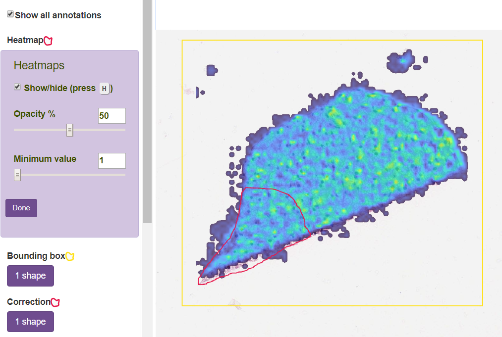
Heatmaps can show hotspots, intensities, tumor probabilities, the output of your deep learning AI model or any other color-coded overlay on a slide. You can zoom in to see individual cells and see how well the results fit, change how transparent the heatmap layer is, what is the minimum value that should be displayed or quickly hide the heatmap overlay to see the original slide. It's also possible to add your own annotation on top of it - for example to use as corrections for active learning - like in the example below.
You can create partial heatmaps that cover only part of the image. Heatmaps are smoothly interpolated to cover the area.
You can now use Slide Score API to setup a request pixels and their annotations for your model, run it and push the results back to Slide Score as heatmaps like any other annotation type for review.


